
Florida-based content marketing agency Fractl recently surveyed 1,000 people about the world’s top 50 brand logos, and the results are in.
Covering lots of different industries, the survey uncovered some surprising trends designers should keep in mind when crafting their next logo.
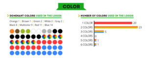
01. Use a simple palette
Of the 50 surveyed companies, a whopping 43 chose to use only one or two colours in their logos. The results also show that blue and red are far and away the most popular colour choices.
Colour psychology is a crucial part of logo design, and blue and red represent opposite ends of the spectrum. Red is urgent and dynamic, prompting instant action from the viewer, whereas blue is more relaxing and encourages trust.
Logo tip
Simple colour palettes are a popular choice
Simple palettes play into the idea of colour psychology and clearly communicate the brand’s desired message. A logo with lots of contrasting colours, on the other hand, with leave the consumer confused about the product and company.
02. Think flat
The prevelence of flat logos has skyrocketed recently alongside the rise of mobile internet browsing. Of the 50 surveyed brands, 45 were completely flat, and of the remaining 5, 3 incorproated a mix of flat and bevelled surfaces.
Flat logos simply look better on mobile devices, and now mobile web traffic exceeds that of desktop computers it makes sense that companies have made the switch.
However, not every brand has had to make a flatness compromise. Volkswagen and BMW both use completely bevelled logos which stand out due in no small part to their raised finish.
By Dom Carter on August 21, 2015 for creativebloq.com


 Follow
 How to Make a Coffee Table Book
 Illustrated Book Publishing: The Basics
 How to Create and Publish a Coffee Table Book
 12 Communication Basics Everyone Should Know
 Subscribe, like, views… branding it right on YouT…


